Monday, April 30, 2012

David Carson


David Carson  http://www.davidcarsondesign.com/

I like to research graphic designers that I can make a connection to or have made an impact on me personally.  In my searching, I came across David Carson. Like all the other graphic designers I had researched, I am familiar with many of his designs, yet did not know of his name.  As an aspiring artist, I admit I feel a little guilty about this! I made a promise to myself to start looking more into things that catch my eye, whether it be a piece of art, a song, or a logo, I feel like I should know more about the people behind the art I see and hear everyday.  David Carson one of the more famous graphic designers and typographers.  Some of his most famous designs are the logos for all types of companies and people, from the House of Blues, Quiksilver, Yale University, Nine Inch Nails, all the way to President Obama. David Carson is best known for being one of the most influential graphic designers of the 1990s. I think this is crucial for his success since this was a decade where technology was evolving at a rapid pace, and to get ahead of it by jumping into graphic design and really, taking control of the direction that the field was going in, is admirable and definitely a huge achievement for him.  
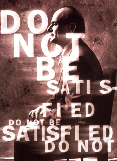
He is exceptionally skilled at taking type and photography and twisting and interweaving them together to produce a completely separate image that can convey deep and powerful messages.  Today, David Carson remains one of the most famous people in the graphic design industry, earning him a reputable image and creating a huge name for him. Here is a link to an interview with Carson from layers magazine, take a look its very interesting to read about all the projects and activities he immerses himself in other than graphic design and typography.

Saturday, April 28, 2012

Saul Bass


SAUL BASS (1920-1996) was not only one of the great graphic designers of the mid-20th century but the undisputed master of film title design thanks to his collaborations with Alfred Hitchcock, Otto Preminger and Martin Scorsese.
When the reels of film for Otto Preminger’s controversial new drugs movie, The Man with the Golden Arm, arrived at US movie theatres in 1955, a note was stuck on the cans - "Projectionists – pull curtain before titles".
Until then, the lists of cast and crew members which passed for movie titles were so dull that projectionists only pulled back the curtains to reveal the screen once they’d finished. But Preminger wanted his audience to see The Man with the Golden Arm’s titles as an integral part of the film.
The movie’s theme was the struggle of its hero - a jazz musician played by Frank Sinatra - to overcome his heroin addiction. Designed by the graphic designer Saul Bass the titles featured an animated black paper-cut-out of a heroin addict’s arm. Knowing that the arm was a powerful image of addiction, Bass had chosen it – rather than Frank Sinatra’s famous face - as the symbol of both the movie’s titles and its promotional poster.
That cut-out arm caused a sensation and Saul Bass reinvented the movie title as an art form. By the end of his life, he had created over 50 title sequences for Preminger, Alfred Hitchcock, Stanley Kubrick, John Frankenheimer and Martin Scorsese. Although he later claimed that he found the Man with the Golden Arm sequence "a little disappointing now, because it was so imitated".
work cited

poster


Thursday, April 26, 2012

Morteza Momayez


Morteza Momayez was an Iranian graphic designer. He was one of the founders of Iranian Graphic Design Society (IGDS) and held a membership to Alliance Graphique Internationale (AGI).  He was the president of Tehran International poster Biennial and Editor in chief of “Neshan”.  Throughout his career, Momayez initiated many cultural institutes, exhibitions and graphic design publications.  The renowned pioneer of graphic design in Iran, Momayez received the Art & Culture Award of Excellence from the president of Iran in 2004.

Morteza Momayez was borne on August 26, 1935 in Tehran, Iran. His father was Mohammad-Ali and his mother was Kochak.  He got his bachelor in painting from school of Fine Art University of Tehran in 1965 and his diploma from Ecole National Superier des Art Deco in Paris, France in 1965.

Morteza Momayez died October 25, 2005


Tuesday, April 24, 2012

Susan Kare


 Icon Designs

Susan Kare is an artist and graphic designer who created many of the interface elements for the Apple Macintosh in the 1980s. She was also one of the original employees of NeXT the company formed by Steve Jobs. She also worked as the Creative Director during that time. She is a phenomenal woman who brought her bring ideas into some of the iconic technology we use today. She had her Ph.D and perused a career after she graduated in Museum of Modern Art. She worked for Apple and that was her biggest job thus far and she was very talented and a friend who believed in her led the way. She is the designer of many typefaces, icons, and original marketing material for the original Macintosh operating system. The unique thing about Susan was her groundbreaking work can still be seen in many computer graphics tools and accessories, especially icons such as the Lasso, the Grabber, and the Paint Bucket. Her typefaces are used in the first four generations of the Apple iPod. So in reading about Susan Kare she is very talented and intelligent through her education and work.

Nichola-Graphic Design Artist

Neville Brody is an English graphic designer, typography and art director. He is an alumnus of London College of Printing and Hornsey College of Art. Brody is best known for his work on The Face & Arena magazines. He has also designed album covers for Cabaret Voltaire and Depeche Mode. Brody launched his own design practice in London in 1994 with his business partner Fwa Richards. The company is known for its ability to create new visual languages, as well as for creating innovative packaging and website designs. His recent projects are the redesign of the BBC in 2011, the Times in 2006 and a new font called Times Modern. His company also launched a new campaign look for Don Perignon in 2007. Brody is also one of the founding members of Fontworks and has designed a few notable typefaces.

Rob Janoff


Rob Janoff

When researching these graphic designers, I try to select individuals with whom I am familiar with their work or at least have heard of it at some point in my life.  When I came across Rob Janoff, I had never heard the name but one of his most famous logos we can all relate to. Rob Janoff is more of a corporate graphic designer; his work primarily is focused on designing for television commercials, logos, and advertisements.  In 1977, a man named Regis McKenna hired him to create a logo for Apple computers.  Today, his logo is seen on almost every Apple product, from computers to telephones to iPods.  Remarkably, this logo is recognizable across many generations, from the very young to the elderly; this is one image many people can identify with.  In my research I came across an interesting interview with Rob Janoff, in which I learned that there is sort of this cult obsession with the logo, where Apple fanatics tattoo themselves with various styles of this famous logo.  I found the interview to be really neat, I urge everyone to check it out, and meet the man behind one of the most common images we are seeing daily, and will continue to see for a very long time!  Rob Janoff is really an admirable man; to create something so simple that is easily recognized by so many people worldwide is a great feat and accomplishment, and to stay out of the limelight and preserve your humanity is even more admirable in this society.   http://creativebits.org/interview/interview_rob_janoff_designer_apple_logo

Monday, April 23, 2012


My stamps of Louis Armstrong. My musical inspiration.

Shigeo Fukuda


Shigeo Fukuda was a sculptor, graphic artist and poster designer who created optical illusions. His art pieces usually portray deception, such as Lunch with a Helmet On, a sculpture created entirely from forks, knives, and spoons, which cast a detailed shadow of a motorcycle.

Fukuda was born on February 14, 1932 in Tokyo to family that was involved in manufacturing toys. After WWII, he became interested in the minimalist Swiss Style of graphic design and graduated from Tokyo National University of Fine Arts and Music in 1956.

His home outside Tokyo featured a 4-foot-high (1.2m) front door that would appear far away from someone approaching the house the house.  This door was a visual trick, with the actual entrance to the house being an unornamented white door designed to blend in seamlessly with the walls of the house.

Fukuda died January 11, 2009.


Prof here is the redo...

Sunday, April 22, 2012

Nichola- Two letter 3

Eric's Poster


Poster for Big Food exhibit at the Peabody

John Alvin


John Alvin was an American designer most known for creating movie posters for some of the biggest films of all time. He first gained notoriety for his poster for the Mel Brook’s Blazing Saddles in 1974- one of my favorite comedies. Over the course of his 35 year career, Alvin created movie posters for the biggest movies of all time including E.T. the Extra-Terrestrial and The Lion King. This list of his movie posters is extensive and includes some of my favorite movies like Blade Runner, Gremlins, Cape Fear, Red Dawn, Willow and Spies like Us.
                In addition to his work in creating movie posters, John Alvin contributed designs to more than 135 films. He created art for some of the biggest franchises in motion picture history such as The Pirates of The Caribbean, Star Wars, The Lord of the Rings and Harry Potter.

Alvin had a close relationship to Disney Studios and worked on a number of animated projects for them. “He captured the heart of whatever the assignment was,” Federico Tio, executive vice president of marketing for Walt Disney Studios from 1990 to 2005, said in an interview on Friday. “John became synonymous with almost all of the recent posters for Disney” — for films including “Beauty and the Beast,” “Aladdin,” “The Little Mermaid” and rereleases of “Snow White and the Seven Dwarfs” and “Pinocchio.” (Hevesi)
These are a couple of the designs from John Alvin that I really liked on his website. The two from the Lord of the Rings franchise, something about the eyes in both these pictures that really grabs my attention. Boba Fett, this is a cool picture of one of my favorite characters from Star Wars. Alvin was clearly a very talented artist.


Hevesi, Dennis. “John Alvin, Designer of Memorable Film Posters, Is Dead at 59.” The New York Times February 11, 2008. Online. Retrieved from: www.nytimes.com/2008/02/11/movies/11alvin.html

Official John Alvin Website: http://www.johnalvinart.com/Default.aspx


Rob Janoff

When researching these graphic designers, I try to select individuals with whom I am familiar with their work or at least have heard of it at some point in my life.  When I came across Rob Janoff, I had never heard the name but one of his most famous logos we can all relate to. Rob Janoff is more of a corporate graphic designer; his work primarily is focused on designing for television commercials, logos, and advertisements.  In 1977, a man named Regis McKenna hired him to create a logo for Apple computers.  Today, his logo is seen on almost every Apple product, from computers to telephones to iPods.  Remarkably, this logo is recognizable across many generations, from the very young to the elderly; this is one image many people can identify with.  In my research I came across an interesting interview with Rob Janoff, in which I learned that there is sort of this cult obsession with the logo, where Apple fanatics tattoo themselves with various styles of this famous logo.  I found the interview to be really neat, I urge everyone to check it out, and meet the man behind one of the most common images we are seeing daily, and will continue to see for a very long time!  Rob Janoff is really an admirable man; to create something so simple that is easily recognized by so many people worldwide is a great feat and accomplishment, and to stay out of the limelight and preserve your humanity is even more admirable in this society.   http://creativebits.org/interview/interview_rob_janoff_designer_apple_logo
 The images above show just some of the different Apple logos and how it has evolved since its creation in 1977. (The date is incorrect, it should read 1977, not 1976).

CD COVER PART 1

MY FAVORITE ARTIST

Thursday, April 19, 2012

Two-Letter Project

This is my Two-Letter Project. I had fun with this project and decided to shadow the same letter twice. I played with many colors and became familiar with the functions.


Vittorio Fiorucci an Italian Canadian poster artist from Montreal Canada.  They say the art fo the fuge spring from being borned in ZaraYugoslavia from Itilian parents.   When Fiorucci was 19 he moved away becuase he was not getting along with his mother at time Montreal was opted so he took off.    He felt an artist had should be free indepedent in the fullest sense of the term.   He is the most famous poser artist.  Fiorucci posters have deck the walls of Montreal for over twenty years and has received many prizes for highly original work.

Fiorucci career began in the early 1960's his first job was a cartoonist in political publications; he then became a full time poser maker.  This is when he started becoming known.  In 1964 he won third prize in the Interantional Cineman poster exhibit in Czechoslovakia.  This was the first time Canada ever won a prize of that kind. 


The way he works is amazing.  When he is aked to do something he immediately has a mental picture of it and often it is the right picture.  His thing is to project his ideas and carry them out spontanouesly.  He does not study the results of his leisure because he will then start seeign mistakes, making changs and then becomes unsure of where he is going with his work.  Unfotunately, Fiorucci died of a stroke on July 30, 2008. 


My stamp Project


I choose to pick one and only Mr King

Mirko Ilić


Mirko Ilić   is Croatian and Bosnian graphic designer and comic’s artist. He published comics and illustrations in magazines.  He became a comic editor for student magazines in 1976. He had many talents including a musical movement. Then he went on to make design album covers of some of the most prominent Yugoslav bands of the time, such as Bijelo dugme. This was a popular band in 1976. That was one of the many he had a passion for graphic designing and art. Therefore he was very spontaneous when it came to designing and he did that very well. He eventually started publishing his work. He stopped working on comics and put more focus on illustration and graphic designing along his way. In 1985, he stopped working on magazines. Thereafter, he went to New York and pursued one of his many dreams and started publishing for The New York Times, Wall street journal and more.  In 1993, he put a great deal of focus into 3-D computer graphics and became a Co-founder of Oko & Mano Inc. graphic design studio. He was a man of all trades I find him phenomenal and he is filled with great ambition.

Wednesday, April 18, 2012

Philip Baxter Meggs


MEGGS WAS BORN ON MAY 30, 1942, IN NEWBERRY, SOUTH CAROLINA.  MEGGS
WAS AN AMERICAN GRAPHIC DESINGER,PROFESSOR, HISTORIAN AND AUTHOR OF BOOKS IN GRAPHIC DESING. HIS BOOK HISTORY OF GRAPHIC DESIGN IS A STANDARD READ FOR FOR STUDYING GRAPHIC DESIGN.

Meggs was also one of the first professional educators to create an overview of the history of graphic design that did not depend on the traditional structure of the history of art.  Meggs believed that graphic design needed to acquire and adequate understanding off the past and its relations with art.

At 16 years of age he practiced typesetting metal in the afternoons after school and enjoyed drawing and painting.

After college, Meggs worked as a senior designer at a metal company any then art directory of a pharmaceutical company.

In 1968, he began teaching in the Communication Arts and Design Department at Virginia Commonwealth University.

.


Meggs later died after a long battle with leukemia on November 24, 2002 at the age of 60.

Dick Bruna

ick Bruna was born in Utrecht (the Netherlands) on august 23, 1927 as Hendrik Bruna in a rather prosperous family. His great-grandfather founded the great Dutch publishing house A.W Bruna & son in 1868, and in the late nineteenth century they had a book store at almost every railway station. Bruna had a rather careless youth. He regularly met authors and designers at his house and as a teenager he gained interest in design.

The publishing house had always been a family business. Bruna was intended by his father to become a publisher too, but he did not have the right attitude for the business side. During the turbulent war years his family spent hiding in Loosdrecht, his aversion towards everything his father stood for (publishing and marketing) grows. He rather spent his time drawing.
"We had a little holiday house near a lake so when the war came we hid there," he says. "There was no food, of course, and I couldn't leave the house to go to school or anything, but we had a pleasant time. I was already sketching constantly: on any piece of paper I could get hold of, I tried to make a little drawing."

Jon Burgerman has cutout pictures of animals above his desk where he works. The first to be added, and probably still his favourite, is a baby penguin going to the toilet, with some force. When not cooing over nature's fluffy defecating creations he likes doodling. His doodles have adorned t-shirts, snowboards, magazine covers, books, toys, computer games and airplane sick-bags. Working freelance enables him to snooze through most of the day; he is at heart a very lazy person.
Work Cited